Portfolio mortality tracking: USA v. UK
In Richards (2022) I proposed a simple real-time mortality tracker that can be implemented in a spreadsheet or R. The tracker is useful for exploratory analysis, spotting data-quality issues and communication with non-specialists. To recap, we require just three items of data:
- The date expressed as a real number,
- The number of policies in force at the start of the day, and
- The number of deaths on that day.
Figure 1 shows an excerpt of the data for a US portfolio of pension risk-transfer (PRT) annuities. Each date is expressed as a proportion of the way through the year. For example, 14th March 2020 would be represented as 2020.199454 (=2020+73/366, with the denominator 366 stemming from the fact that 2020 was a leap year). Figure 1 shows that the data requirements are entirely privacy-safe - no personal data are present, so the likes of GDPR, CCPA or PIPEDA do not apply.
Figure 1. Policies in-force and deaths occurring for each date in a US PRT portfolio. Users of Longevitas can generate this file automatically using the "Data Audit" operation.
![]()
The mortality tracker of Richards (2022) is based on a two-part calculation. The first part is a variation on the Nelson-Aalen estimator of the integrated hazard. However, as suggested by Figure 1, we define this in terms of events in calendar time, rather than by age. We therefore have the Nelson-Aalen estimator of the integrated hazard from time \(y\) to time \(y+t\):
\[\hat\Lambda_y(t) = \sum_{t_i\le t} \frac{d_{y+t_i}}{l_{y+t_i^-}}, t\ge0 \qquad(1)\]
where \(y+t_i\) denotes one of the discrete values in the Time column of Figure 1, \(l_{y+t_i^-}\) denotes the number of lives alive just before the start of the day and \(d_{y+t_i}\) denotes the number of deaths on that day.
The second part of the mortality tracker is to estimate the portfolio hazard rate, \(\hat\mu_{y+t}\). For this we take the central difference quotient of \(\hat\Lambda_y(t)\) as follows:
\[\hat\mu_{y+t} = \frac{\hat\Lambda_y(t+c/2)-\hat\Lambda_y(t-c/2)}{c}, t\ge c/2\qquad(2)\]
where \(c>0\) is a smoothing parameter that is set subjectively by the analyst to iron out random variation. The larger a portfolio is, the smaller the value of \(c\) can be used to reveal detail. Note that in equation (2) \(\hat\mu_{y+t}\) is undefined at the right where \(t<c/2\)). The more smoothing that is applied, the less insight is available for the most recent mortality.
An example of \(\hat\mu_{y+t}\) is shown for the US PRT portfolio in Figure 2:
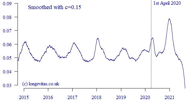
Figure 2. \(\hat\mu_{y+t}\) for US PRT portfolio with \(c=0.15\). Data extract taken in September 2021.

The tracker may be simple, but it nevertheless reveals lots of detail about the patterns of portfolio mortality in time. For example, Figure 2 shows the seasonal variation that is common to such portfolios, with winter mortality usually peaking in January in the Northern Hemisphere and reaching a summer trough in the middle of the year; see Richards et al (2020) for further examples of pensioners in Australia, Canada, Chile, Kuwait, the Netherlands and Spain. There is variability in winter mortality, too — Figure 2 shows winter peaks in January 2019 and 2020 that are modest compared to the higher, sharper peaks of January 2017 and 2018, for example.
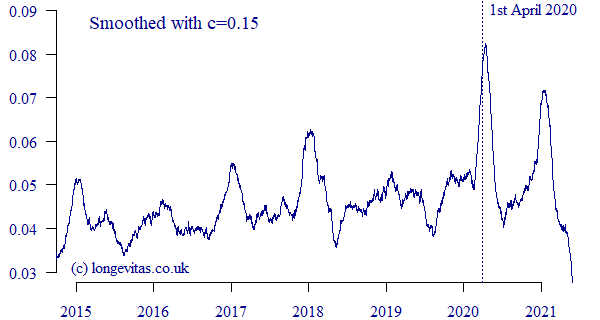
The arrival of Covid-19 can be seen in the non-seasonal peak around April 2020 in Figure 2. Similar peaks at the same time were demonstrated in UK and French annuity portfolios in Richards (2022). However, for the US PRT portfolio in Figure 2 we can see that the Covid-19 shock of April 2020 was no worse than the winter peak of January 2018. In contrast, the second Covid-19 wave in this portfolio coincided with winter to produce a dramatic shock peaking in December 2020 and January 2021. This is the reverse of the pattern in a UK annuity portfolio, where the first Covid-19 shock was more severe than the second, as shown in Figure 3:
Figure 3. \(\hat\mu_{y+t}\) for UK annuities with \(c=0.15\). Data extract taken in June 2021.

The contrast in Covid-19 experience between Figures 2 & 3 shows national differences, and also the importance of carrying out portfolio-specific analysis. The final aspect of Figures 2 & 3 is the fall-off in mortality as we approach the extract date, which is due to unreported deaths at the time of extract (my earlier blog discusses how to allow for such delays).
The R script accompanying this blog takes CSV data files in the format of Figure 1 and produces charts like Figures 2 & 3.
References:
Richards, S. J., Ramonat, S. J., Vesper, G. T. and Kleinow, T. (2020) Modelling seasonal mortality with individual data, Scandinavian Actuarial Journal, 2020:10, pages 864–878, doi 10.1080/03461238.2020.1777194.
Richards, S. J. (2022) Real-time measurement of portfolio mortality levels in the presence of shocks and reporting delays, Annals of Actuarial Science, doi 10.1017/S1748499522000021.
Previous posts
Dr. Iain D. Currie
It is with great sadness that we note the passing of our long-term collaborator, Dr. Iain D. Currie, on 24th May 2022.
Reheating a Cold Case
In criminal investigation, it is well known that passing time obscures the facts, making what happened more difficult to discern. Eventually, the case turns cold - unlikely to be solved unless we discover new evidence. In some ways for over a century, epidemiologists have been dealing with just such a cold case, picking through the rubble of the 1918 Influenza pandemic and trying to make sense of what they find. But as we will see, debate continues in a number of areas.


Add new comment